Sheldon Ceramics is a small ceramics company in Downtown Los Angeles providing high-end, handmade tableware and decorative pieces for the home.
My Role
• Information architechture
• Requirements discovery
• UI/UX design
Timeline
Oct – Nov 2018
Timeline
Oct – Nov 2018
Team
Emily Detweiller: User testing, Visual design
Background
This project is a site redesign focusing on the homepage, collection and product pages using the brand’s existing style guide. User research and analysis of customer service inquiries identified three key problems:
- Lack of visual hierarchy and calls to action on the homepage: 0/10 users correctly identified the site type in a 5 second test
- Confusing product organization: users have trouble locating certain products and it's unclear that all products belong to collections
- Choosing a glaze color is confusing and there’s not enough information about how each one looks
To increase online sales and to address the above problems, our solutions were to:
- Create more obvious calls to action on the homepage
- Restructure product organization for a better mental model of product offerings
- Provide easy-to-find information about the studio’s in-house formulated ceramic glazes
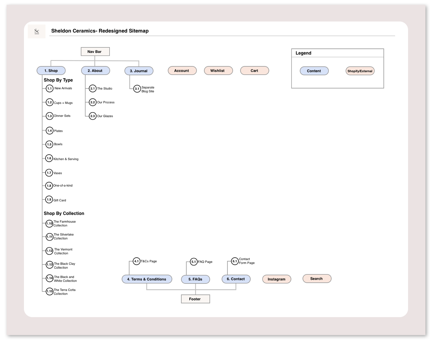
Information Architecture
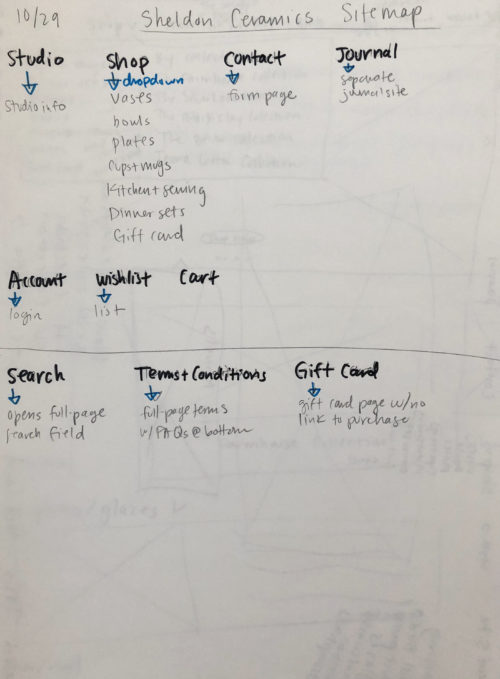
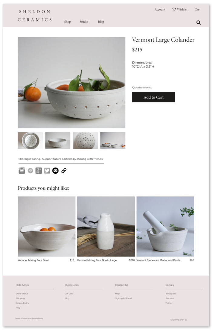
- Products are now organized by both “type” and “collection"
- Customers looking to add more Sheldon Ceramics products to their homes can view an entire collection at a glance
Wireframing
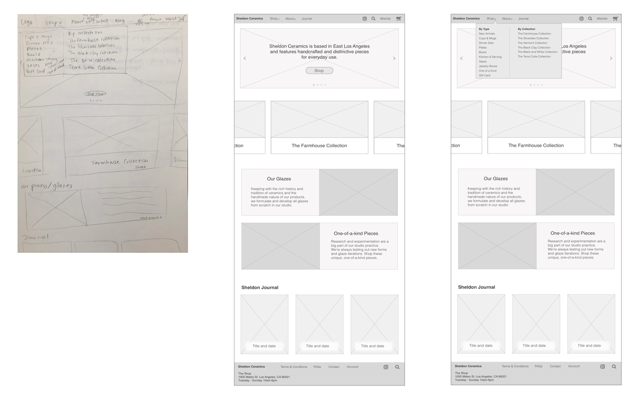
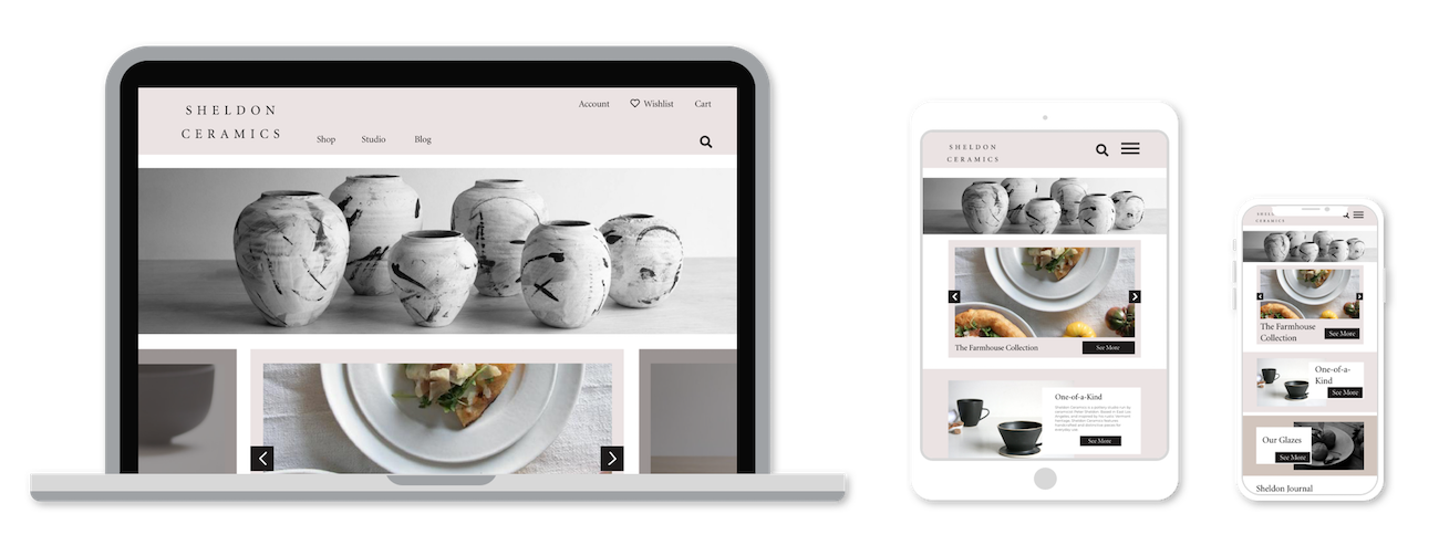
- A large hero image with text and a “shop” button provides immediate context and a call to action.
- A swim-lane featuring cards for each Sheldon Ceramics collection puts the products into context.
- Cards providing information about ceramic glazes and another popular topic in customer service emails: one-of-a-kind pieces.
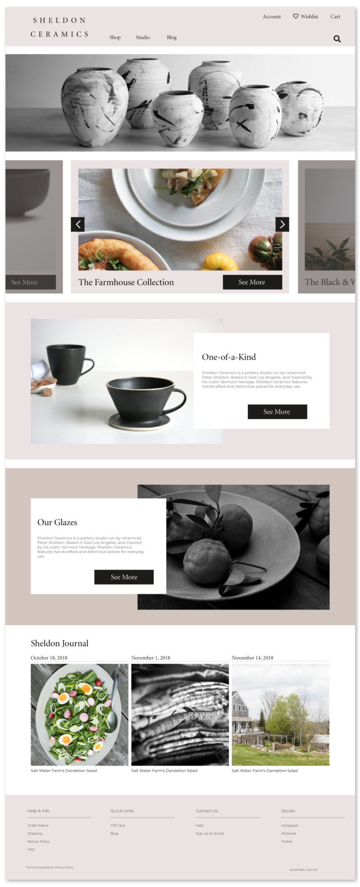
Full-Color Designs

Reflection
Though the stakeholder ended up deciding that a full site redesign was not in the studio’s near future, this project was a very useful learning experience in user-centered design.
As someone who is close with the company and familiar with their philosophy, products, and clientele, this project was a joy to work on. This also meant I was very familiar with user needs and common pain points. With a clear picture of what wasn’t working with the site, creating solutions was a satisfying way to practice the design process.
This project also taught me about conveying the importance of implementing good, custom design to stakeholders and recognizing when a business isn’t ready to make that step.